Hi there!
Recently I have spent less time developing Busuu, than using it. I will walk you through positive experiences and “To improve” here.
What I like about the app
- In general the app gives so much value, that for a serious learners it’s worth a lot more that what it’s being sold at. Essentially giving you a classroom quality experience with full flexibility of when and how to learn. Having teachers on board and the course structured in a similar way is something that could be communicated more to the potential customers. After all this is what everyone says after having some experience with the Owl and Busuu – it feels as if you were in the class, can see the teachers speaking, there is logic to the lessons and on the other hand “your elephant is pink” standard. I would say “make the marketing hay whlie the sun shines” as I am sure they’re working on improving this image relentlessly.
2. Summaries
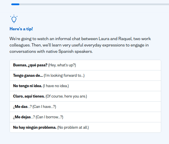
These kind of summaries above. Super useful, I am a kind of learner that like to write things down (hence I liked Confluence when I was at Busuu ;)) So I literally write stuff down to my notebook.
3. Social element – especially writing and having a possiblity to have some feedback. Also replying to these comments as it’s nice to thank them for their help.
4. Lack of bots – thanks Adam!
5. Live and group lessons – that’s for me to discover once I have some more courage to speak in Spanish.
To improve
I have gathered a few things that I see could be improved in the user experience. I would be so grateful if these could be implemented!
Did one list on Busuu’s confluence before and now, when focusing on learning Spanish a lot more and after buying my premium membership (Anais, used the discount you set up, they work nicely 😉 I can tell you what would make the learning experience much better in my eyes.
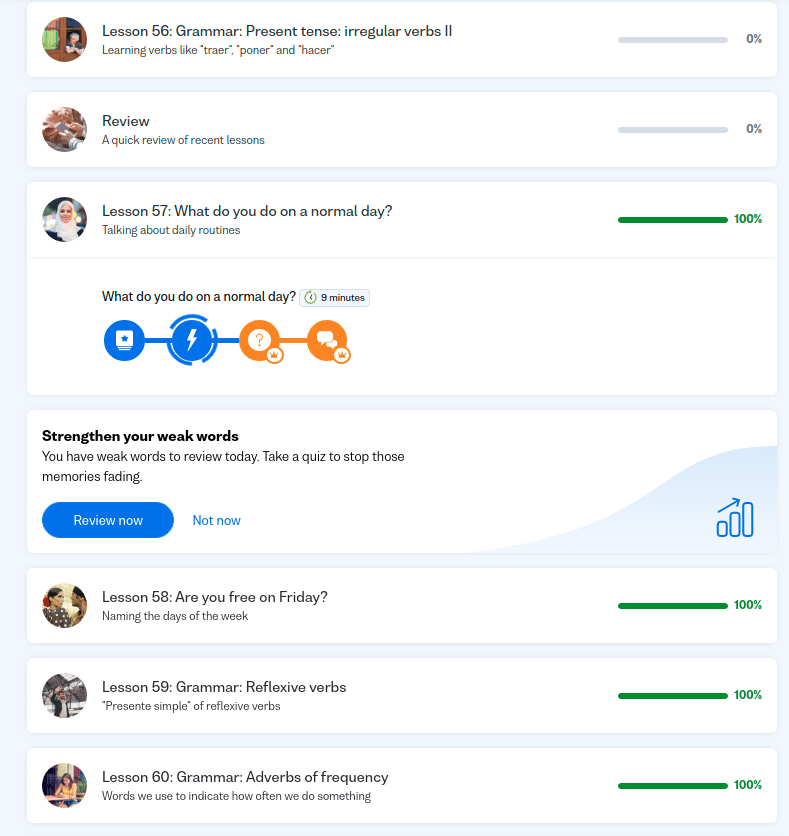
Problem: Web app has minutes, Android app has stars.
Solution: Have both shown in the mobile app and in the web app

2.
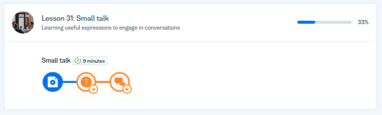
Problem: I keep getting transferred to the lesson in the past (57 – after switching in the left menu from “Review” to “Lessons” for instance). The second icon with the lightning is an animation. As you can see I have
Solution: if this can’t be fixed in the app, let the users mark the lesson as “completed”. They might want to skip some lessons anyways and use this feature.
3.
Problem: As a web app, arriving at the “Lessons” page I don’t know what’s the unit in the lesson I should be continuing with. The colours here (blue – completed, orange – not started yet) or does it refer to premium – orange goes with the crown?)
Solution: Mark, using a universally recognisable method that a unit has been completed and which one I can continue with? Blue and gray to make it obvious.
4.
Problem: As a premium member I don’t need to see what’s premium and what’s not – it’s adding to the UX confusement with Point 3. Same image as above here.
Solution: Show the free/premium units only to free users
5.
Problem: Make it possible to see the progress on individual days (How many minutes did I spent learning yesterday?). It’s much easier for a learner, when they are trying to stick to a routine to trade one day’s minutes for another in order to catch up if they skipped one day.
Solution: by tapping in the Study Plan on day icons, I should see how many minutes/stars I did each day.
6.
Problem: Study plan is listed as an important feature. The biggest advantage is in the knowing on what day in the future I will have reached my goal. Yet the study plan is limited to 30 minutes per day. What if I spend more time?
Solution: Make the tool do what it “says on the packaging” and allow for more than 30 minutes per day.
Summary
Again I wish Busuu lots of success as it deserves it. Keep working and providing the value. After all it’s not that much common in the app business 🙂
